Introduction
To reiterate, I am looking at media channels that influence the appearance and mental health and well-being, resulting in ‘compare and despair’ syndrome. I am creating an awareness campaign on how culture and community support young consumers and develop new insights for the beauty industry to support a positive change.
I am aiming this at young consumers to encourage a positive outlook and at beauty industries, corporate social responsibility towards their young consumer target audience.
Creative and Technical – What I am doing
The brand colours are based on Instagram’s gradient as it’s easily recognisable, I wanted to make a connection with the campaign being media orientated. The concepts are based on my research and the strongest message I gained from students was that they wanted to see unfiltered images from brands, so #brandsunfiltered is a hashtag, I wanted to use on social media, for communication between consumers and brands.
I have come up with the tagline ‘Be beyond comparison’ for the campaign as I’m trying to get the message across to rise above comparing ourselves to everyone including models are not all the same. As well as being a positive statement which potentially makes people feel better about themselves.
I have created a social media campaign using story dimensions (aspect ratio of 9:16) for Instagram and Facebook. This has been designed in Adobe Illustrator, Photoshop and After Effects. The animated mp4 story can be viewed here: https://www.instagram.com/reel/CuFHGyOAae0/?utm_source=ig_web_copy_link&igshid=MzRlODBiNWFlZA==
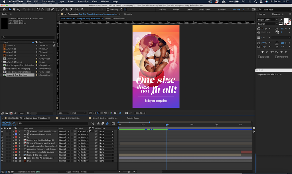
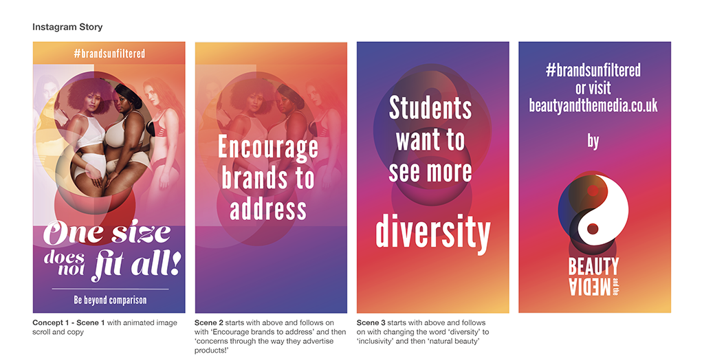
All the concepts shown below would follow the same theme as concept 1 above, an animated story rolled out over a sustained period.
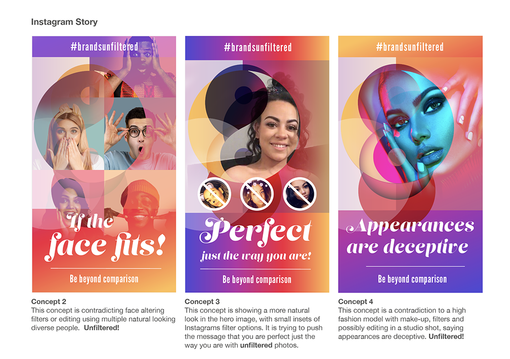
I have experimented with transparencies through my abstract layered onto the background gradient, and then sourced images either from personal images of my family members or I have bought licenced Shutterstock photos of models. The photos have been blended into the abstract in Photoshop.

Email Split Test A for Feedback from Peers
Using concept 4 from my social media, I have developed this into an email visual. The hero image and title ‘Appearances are deceptive’ is then followed typographically with ‘face altering filters’, ‘Studio aesthetics’, ‘Editing’, and ‘filters’ which is spelling out what the image is and making a point. With the tagline ‘Be beyond comparison’ I am trying to get across – don’t compare yourself to high gloss models. The email details what consumers want to see more of and tries to encourage communication on the subject on social media. As well as encouraging traffic to the website via the ‘learn more’ button which points to here: http://beautyandthemedia.co.uk/ I will discuss the development of this site in my next post.

Email Split Test B
The hero image and title ‘Focus on you!’ works alongside the hero image on the left showing a girl on her phone comparing herself on social media, while a girl on the right is happy and focusing at you, the audience. With the tagline ‘Be beyond comparison’ getting across the message don’t compare yourself to others on social. As email A, email B details what consumers want to see more of and tries to encourage communication on the subject on social media.
Email Campaign Qualitative Deduction
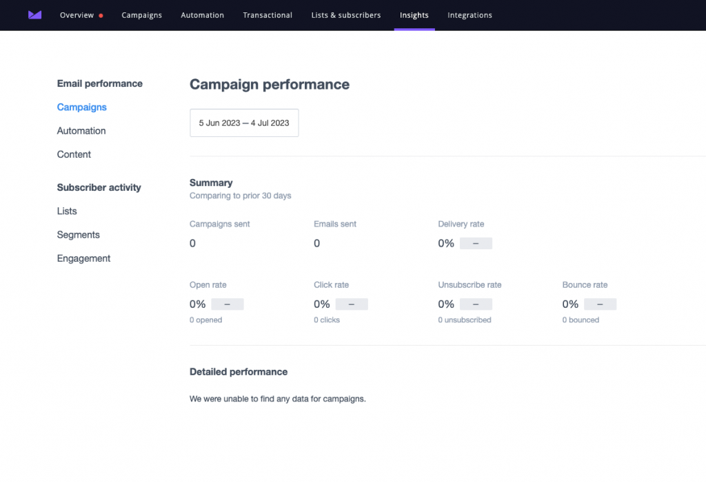
I have exported .pngs of the graphics from Illustrator and uploaded them into Campaign Monitor along with some email addresses of my class peers to test the campaign to see how much engagement I got from clicking on the website link.
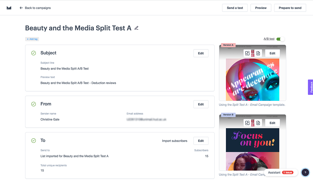
I signed up for the free version and sent the email campaign, but no one got the A/B emails, I don’t know if the University had blocked them as it is from Campaign Monitor. As an alternative option, I sent them again but as a test I did get through, but I lost out on the analytics, shown below. I have had some verbal feedback. Both emails had there links clicked and email A and B were equalled favourite among my peers for layout, but A as the most impactful hero image.
657 words

